Tackling drop-off and accessibility in USAGov’s “Scams and Fraud” Wizard
Client: GSA—Public Experience Portfolio | Year: 2023-2024
Role:
Lead UI/UX design
Team:
1 UI/UX designer, 1 UX researcher, 1 project manager, 1 GSA lead
Tools:
Figma, Jira, Mural, Usertesting, Trello
Goal:
Reduce user friction, boost accessibility, and cut drop-offs to improve scam reporting on English and Spanish Scam Wizard sites.
Navigation
How would you report a scam?
Scammers are on the rise and fraud attempts increase year-over-year. If you received a scam attempt, know that you are not along. Newly released Federal Trade Commission data show consumers reported losing more than $12.5 billion to fraud in 2024, which represents a 25% increase over the prior year (FTC 2025). You may have noticed an increase in any of the following scams within the last year:
- A call from your local police, fire or state department requesting a donation support all they need is your name, address and banking information.
- A text message from a mail carrier, or a trusted postal service claiming a package arrived at a customs agency. Customs agents suspect contraband is in your package and are requesting your information to investigate and release it. However, you have requested no packages in months.
- You received a call from a strange number claiming a family member is being kidnapped. That voice sounds exactly like them. You call your family member and, to your surprise, they are safe in the comfort of their home.
- You received a check in the mail and decide to cash it. Now all your savings are gone.
- The IRS sends you a message claiming you owe them money and will arrest you if you do not pay.
- You received a text message from the Department of Transportation regarding unpaid tolls and penalties. The attached link looks convincing, but you are not sure of its source.
Every year, millions of Americans fall victim to scams and fraud. As technology evolves, we can expect them to increase. We require scam reporting procedures, available options, and self-protection strategies.
This widespread and growing problem highlighted a critical need for an effective, user-friendly pathway for citizens to report and protect themselves from fraud, leading to our work on the USA.gov Scams and Fraud wizard.
Project overview
To raise awareness and guide users to the correct reporting agency, USA.gov created a scam and fraud wizard to help address, guide and protect people from deceitful practices that try to rob you of your money and peace-of-mind. This year-long project involved multiple divisions—Content team, Analytics team, UX team, GSA Board of Directors (among others)—whose contributions and insights shaped the tool into a new, more accessible product for everyone.
Although initial user research on the prior iteration of the scam wizard revealed many positive traits, we also noticed:
- increased user drop-offs after the initial landing page,
- user friction on deciding which scam pertained to their case,
- a need to highlight how the scam started,
- confusion regarding what the tool actually does,
- and uncertainty about what exactly qualifies as a scam.
The design contained around 88 prototyped pages in English and Spanish, with key considerations for accessibility and addressing various mental states.
Initial user research findings
Before I got to work, we reviewed as a team the initial findings. When asked regarding the overall impression, many users were very positive about the old scam wizard experience. Key highlights included:
- By removing unnecessary wording and creating a clear path, the participants felt calmer and more confident.
- Most participants prefer the scams wizard because it is intuitive, simple, and useful.
While we knew users were interacting well-enough with the old scam wizard, we also saw our helpfulness score in the low 50s and a big audience drop on the initial page. We knew we were in the right direction, yet still missing the mark.
To get further insight, our researcher interviewed around 20 participants total between our English and Spanish users (10 desktop and 10 mobile), aiming to get an idea on what is working and where we can improve.
One finding revealed participants would like more descriptive information from the wizard. Others highlighted the emotional feelings and stress experienced during a scam and how not having an indicator on how long the reporting process would take made it even more stressful and anxiety-inducing. While we had many questions, we focused primarily on three essential questions.
01 Did users find this page useful?
The scam wizard scored in the low 50s for page helpfulness, significantly lower than the average for content pages across the site. Is this because of helpfulness or misunderstanding of the page’s intent?
02 Did people find the right options?
70% of page views on wizard results pages have “other” or “otro” in the URL. This suggests many people aren’t connecting with the specific choices in the questionnaire pages. Is there a confusion on the wording?
03 Is this what users were expecting?
A big audience drop happens on the start, about 1/3 don’t make it to the first questionnaire page. Are users confusing scams for complaints? What are they looking for?
The analytics team shared a report from March 2023 with 80,805 unique page views and 47k non-bounces so we may gather additional insights and used it to base our assumptions. I used this information to gather key survey responses, understand where the drop-offs occurred and get a sense of the user flow.
Improvements and iterations
Initial changes
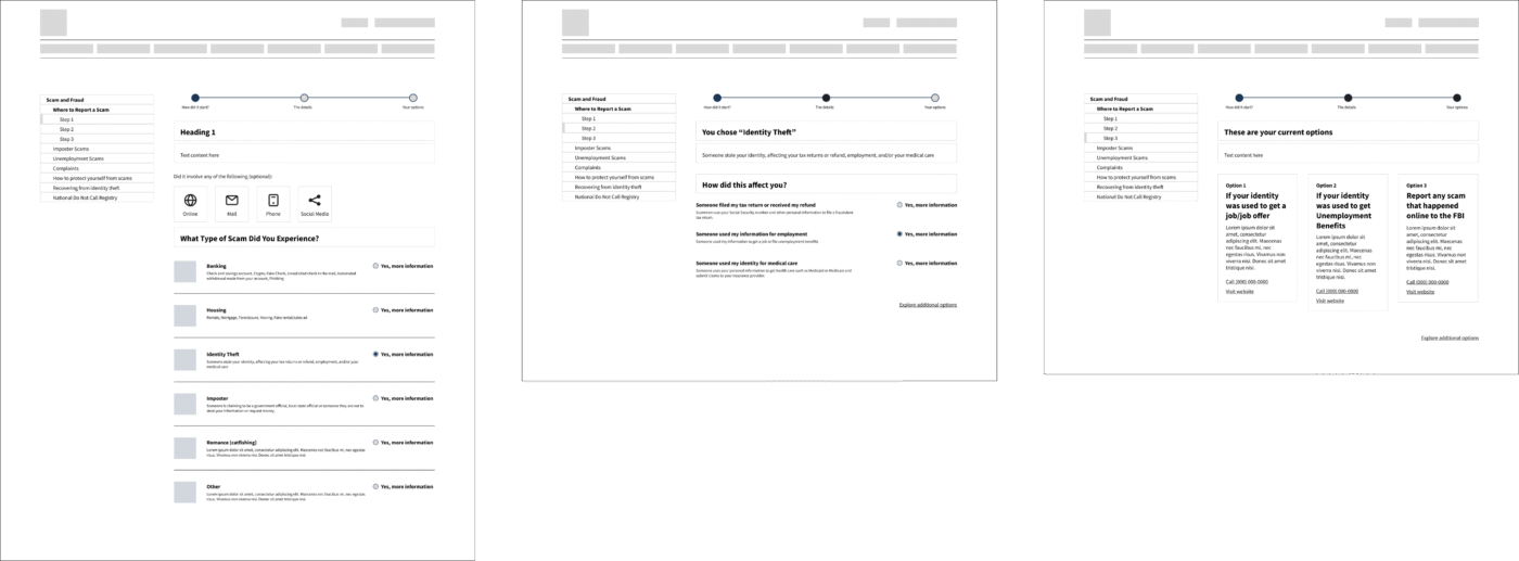
I restructured the initial page, offering instead to provide information upfront and reduce initial friction. This required me to include more information up front and removing an additional step. My aim was to make sure the language clearly defined this wizard as a guide and not a reporting agency.
On the initial page, I also needed to address the difference between a scam and a legitimate complain about a company. I included a guidance and link where users can verify if they are in fact looking to complain about poor business practices or fraudulent activities.

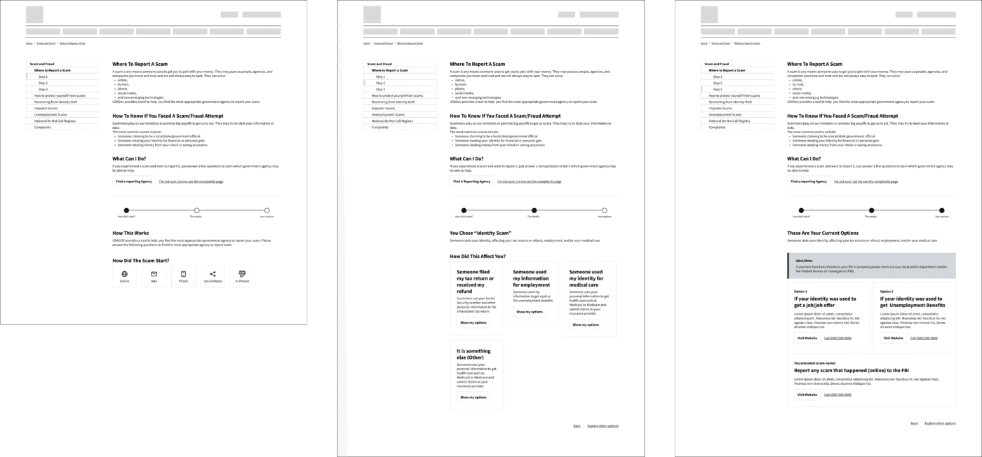
- Since most people reaching this page are distressed or frustrated by the scam, I maintained a similar structure to the content pages—reducing cognitive load and ensuring they do not need to re-learn where things are in this area.
- The previous wizard removed the secondary navigation (sidebar) and we noticed some users struggled to go back or know where they were. I re-added the sidebar to reinforce additional links to relevant topics and guide users through the current stage of the wizard. Since this is a content scope consideration, this remains inactive, to be implemented in future phases.

- Most users confused the meaning of imposter scam and identity theft scams. My initial attempt was to add a brief description to help guide users in selecting the correct choices. I also extended the descriptions to provide additional context and specifications to what we are referencing.
- Based on the research, we also noticed people would associate the scams with how they received them—phone, text, email, etc. To accommodate these mental models, I included them as points of entries to help users. This only serves to please the mental model and has no bearing on the outcomes.
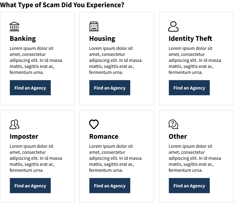
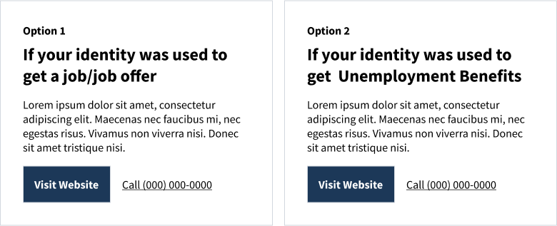
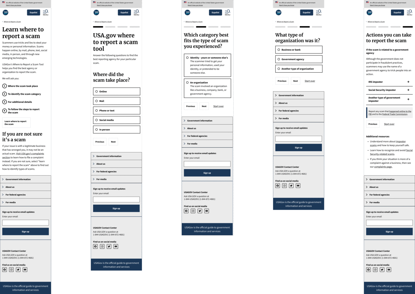
- My initial results pages had a card (or multiple cards) component detailing steps and directions to report the scam. It presented as options so the user can choose which path they felt most comfortable with.

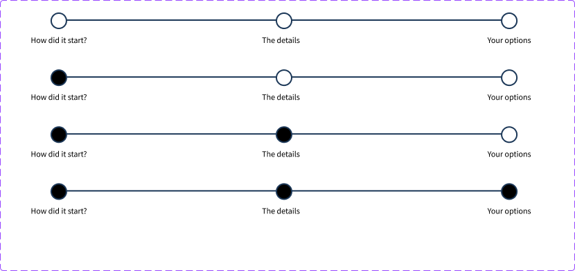
- Since users felt unsure about the length of the wizard, I included a step indicator, so they could understand where they were in the process and how many steps remained. The indicator, also placed in the sidebar, served as a navigational step. This would be based on USWDS component designs and structures.
Adjustments to initial proposal
The initial changes addressed the user needs, but technical and accessibility requirements also changed what was practical and necessary. In addition, there was an ongoing project that aimed to connect the scam to a conversational design framework. The primary concern of the initial proposal was regarding the cards and process indicator. Since the initial solution was based on desktop, we also shifted focus to how these interact in mobile.
I needed to make the following changes;
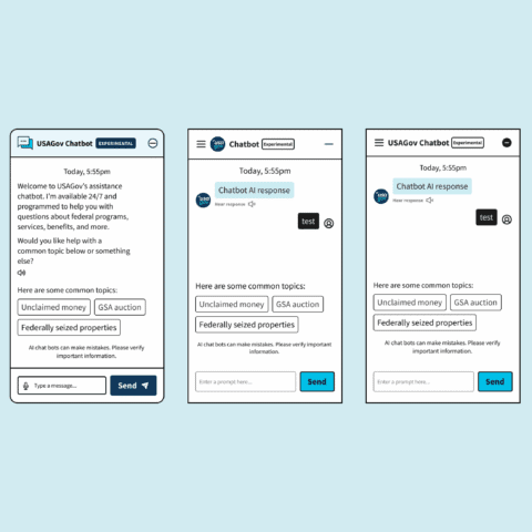
- There was a plan to connect the wizard with a voice user interface (VUI) chatbot. The initial proposal did not address the category “other”. This is a requirement for conversational design.
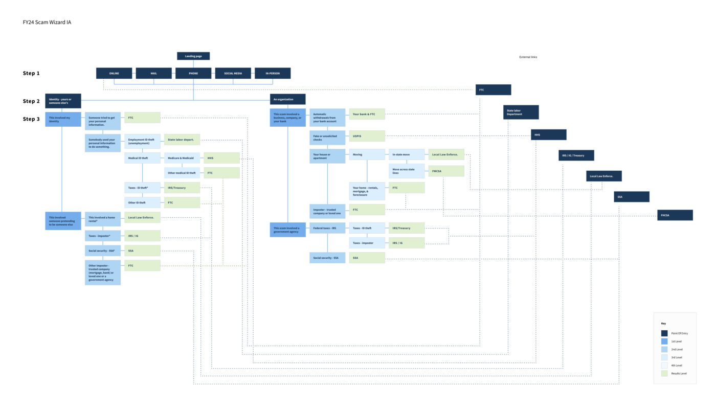
- Although most results lead to the Federal Trade Commission (FTC) website, there was no consistent path, making it difficult to place a step indicator. I needed to revisit the information architecture (IA) and reduce the amount of steps that would make this possible.
- Accessibility review revealed there would be some complications creating the cards components. Since most of the cards also pointed to the FTC site, it would be confusing for users to have multiple cards that point to the same location.
- Card sorting and tree-jack tests also revealed that, while the descriptions helped, people remained confused on certain terms. Again, the IA would aim to simplify the grouping into two base categories: Organization and Identity Scams.
- In order to simplify the content, I took advantage of accordions to simplify and group responses.
Additional improvements

Once we tested the new solution, we noticed users remained confused on the final results page. Some users felt the page was too long, and others struggled to identify when the accordion would open or close. To enhance this experience, I made the following changes:
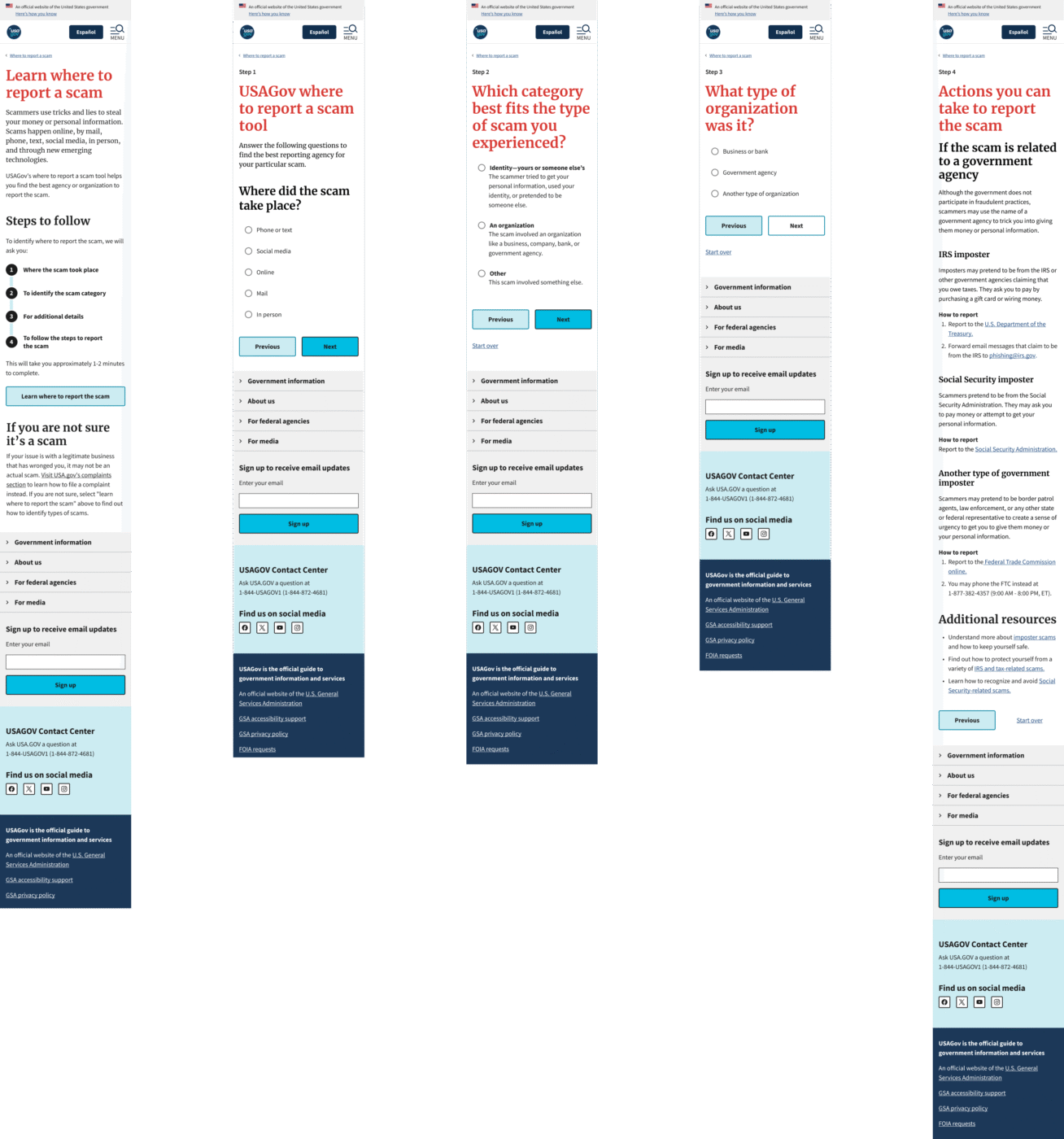
- Removed the accordions and have the results page only answer one solution at a time.
- The step indicator was no longer usable as such, yet we still needed to let users know where they were. I opted to add a process list on the homepage, showing how long the process should take—approximately 1–2 minutes—and the expected flow. This would be based on USWDS component structures and guidelines.
- Since we removed the step indicator, I opted to add a visual cue to the user on which step they are in the process as a pre-title.
- I also added the additional resources onto the end pages if the user needs more resources on what they should do.
- Since we abandoned the cards in the previous iterations in favor of radio buttons, I noticed many users would click outside of the circle expecting it to select. To address that issue, I added a hover state to the radio buttons. Accessibility confirmed this was possible and a recommended improvement.
Reflection & outcomes
Following final refinements and usability testing, key stakeholders approved the updated reporting wizard, noting that it exceeded expectations in clarity and functionality. With its launch timed ahead of the IRS tax filing season, the tool will support a significant uptick in user traffic—serving as a primary point of reference for fraud and scam reporting on USA.gov. By simplifying the user journey, we aimed to reduce drop-offs and improve reporting completion rates by 40% (estimate) in English and Spanish sites. Metrics are currently being tracked to validate our success.
Lessons learned
- Scams often affect older adults, low-income communities, and minorities the most. The tool isn’t a reporting platform, but it’s often the first place users turn to in stressful situations. This makes designing for clarity essential—using plain language, supportive visuals, and accessibility features to reduce confusion and frustration. Keeping the user’s emotional state in mind helps build trust and guide them toward the next step.
- The government needs to create with everyone in mind, making accessibility a fundamental component of each product. This understanding shaped my design decision, ensuring the wizard was truly usable for diverse audiences, including those interacting with assistive technologies or facing disabilities.
- I learned that the government moves purposefully, involving extensive testing, reviewing, and confirming hypotheses before implementing change, which fosters constant iterations and improvements, creating better products in the long-run.
- Justifying changes in a large enterprise requires a lot of documentation and proof. To a certain extent, this made me a lot more focused on my documentation, ensuring that it is understandable and detailed where needed.
