Redefining digital fitness for women with Health House
Client: Health House Studios | Year: 2022
Role:
Lead visual design and wireframing
Team:
2 UI/UX designers
Tools:
Photoshop, Illustrator, Figma, Adobe XD
Goal:
Create a new visual identity for a home-health product guided by HH brand
Navigation
A step away from your typical male-oriented gym.
Health House Studios, based in Los Angeles, CA. Their brand is very image based with bright colors. Health House is very much a high-intensity workout studio.
Objective
Health House has two target audiences
- Predominantly male focused youth who want to build up their muscles. This includes athletes and traditional body-building work-out regiments.
- Women who wish to tone and improve mobility at home with a monthly subscription.
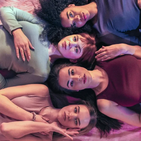
Our goal was to steer away from the masculine identity of the principal brand and create an opportunity to bring back some of the warmth and feminine attributes from their 2018 re-brand into their HH at Home mark.
Problem
The 2018 re-brand proposed a very strong, impactful font for a male audience. Currently, the brand uses dark images with a male focused approach, and very little images of women or exercises geared towards them. Since HH at Home runs on a calendar based program, we needed to consider CTAs that will lead people to register, view and engage in upcoming classes.
Wireframes
Our original wireframes included a standard flow based on what they were currently using and/or requesting. In these examples below, I tried to work with the fonts from their brand. I tried to identify a UX structure that may be appropriate. I held multiple conversations for various weeks until we made a final decision to move forward into the design phase.
Results
As with all brands, we made concessions to achieve a vision. The results were to simplify the design to create a luxurious feel. This meant utilizing white as a primary color so that we do not introduce any alterations to the brand, a softer, geometric font to add some femininity to the content, and more images of women in a lighter palette.


