Redesigning USA.gov’s Scams and Fraud Wizard to serve millions in crisis
Client: GSA—Public Experience Portfolio | Year: 2023-2024
View Live: USA.gov Scams and Fraud Wizard
Role:
Lead UI/UX Product design
Team:
Cross-functional collaboration with UX researcher, PM, GSA leadership, Content team, Analytics team, and Accessibility team
Tools:
Figma, Jira, Mural, Usertesting, Trello
Navigation
The challenge:
When millions of Americans get scammed, where do they turn?
Here’s a sobering stat: In 2024, Americans lost $12.5 billion to fraud—a 25% increase from the year before. And those are just the reported cases.
When someone realizes they’ve been scammed, they’re usually in one of two states: panic or rage. They need help now. USA.gov’s Scams and Fraud Wizard was built to be that lifeline—guiding distressed people to the right reporting agencies so they could take action.
But here’s the problem: the tool wasn’t working as well as it should.
The data told a pretty clear story:
- 33% of people dropped off before answering the first question
- The helpfulness score sat in the low 50s (way below the site average)
- 70% of users ended up selecting “Other” because they couldn’t find their specific scam type
I was brought in to lead the product design strategy for a complete redesign. This meant balancing user needs with government constraints, coordinating across multiple teams, and designing for people in some of the most vulnerable moments of their lives.
This wasn't just a UX problem—it was an organizational puzzle
Here’s what most people don’t realize about designing for government: you’re not just solving user problems. You’re navigating an ecosystem of teams, each with different priorities, different definitions of success, and different approval processes.
For this project, I had to coordinate across:
- Content Strategy team → They controlled messaging and IA decisions
- Analytics team → They measured success through behavior data
- Accessibility team → They ensured 508 compliance and WCAG standards
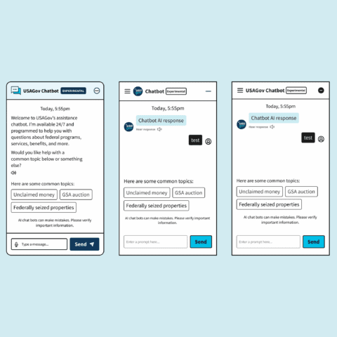
- Conversational AI team → They were building a chatbot that needed to integrate with our wizard
- GSA Board of Directors → They needed to approve everything and ensure alignment with presidential mandates
- Spanish language team → They ensured parity across English and Spanish experiences
My role became less about “designing screens” and more about being the connective tissue between these groups—translating technical constraints into user needs, and user needs into language that stakeholders could rally behind.
First things first:
What does "success" even mean?
Early stakeholder meetings revealed something interesting: everyone had a different idea of what success looked like.
The Analytics team cared about task completion rates. The Content team wanted to reduce support calls. The Board was focused on compliance with presidential mandates around fraud prevention.
I needed to align everyone under a shared vision, so I reframed the success criteria around three strategic pillars:
- Reduce cognitive load for users in crisis → People are stressed. We need to make this dead simple.
- Improve content discoverability → With 70% of users selecting “Other,” we needed to rethink how we were organizing scam types.”
- Build scalable foundations for future AI integration → The chatbot team needed us to think ahead.
This reframing helped me make faster decisions later. When trade-offs came up (and they always do), I could point back to these pillars and say: “Does this serve our primary goal of reducing cognitive load?”
Research that changed everything
I partnered closely with our UX researcher to dig into what was actually happening. We looked at:
- Survey responses from ~300-500 users (collected across 80,805 page views by the Analytics team)
- 20 moderated usability sessions across English/Spanish and desktop/mobile
- Card sorting and tree-testing to validate our IA assumptions
Three insights completely shaped my design strategy:
Insight #1:
People didn't understand what the tool actually did
A third of users left before answering a single question. They’d land on the page, get confused about whether this was a reporting platform or a guidance tool, and just…bounce.
What this meant for design: We needed to set clear expectations upfront, even if it meant adding more content to the landing page.
Insight #2:
Our terminology was confusing people
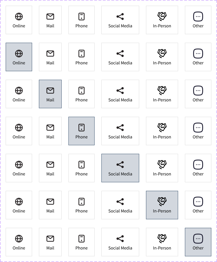
70% of users ended up selecting “Other” as their scam type. This suggested a fundamental mismatch between how agencies categorize scams and how people actually experience them.
We dug deeper and realized the problem: Federal agencies categorize scams by type (imposter scam, identity theft), but users think about scams by delivery method (phone call, text message, sketchy email).
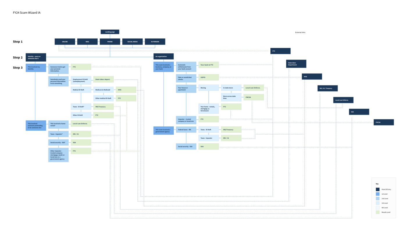
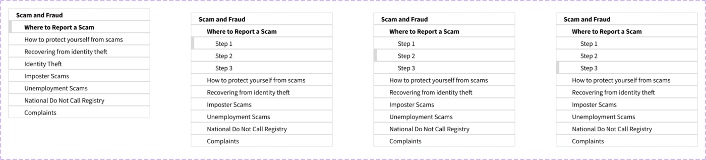
What this meant for design: I needed to rebuild the entire IA around mental models—how scams start—rather than how agencies categorize them.
Insight #3:
Anxiety about "how long is this going to take?" was real
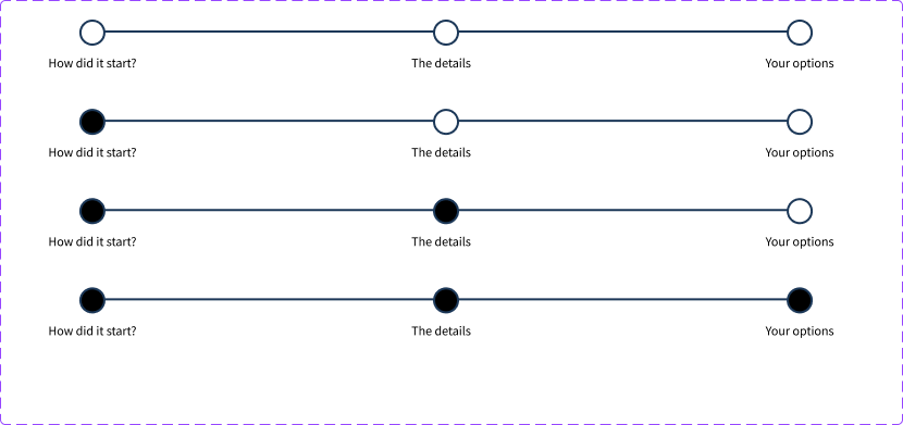
In testing, people kept asking: “How many questions are there? How long will this take?” The uncertainty was making an already stressful situation worse.
What this meant for design: Transparency beats brevity. Users needed progress indicators, even if it complicated the mobile experience.
The big design decisions (and why they weren't obvious)
Decision #1:
Adding content to reduce friction
The tension: Every UX principle says “reduce friction by removing steps.” Less is more, right?
But our data said the opposite. People needed more information upfront to feel confident enough to start.
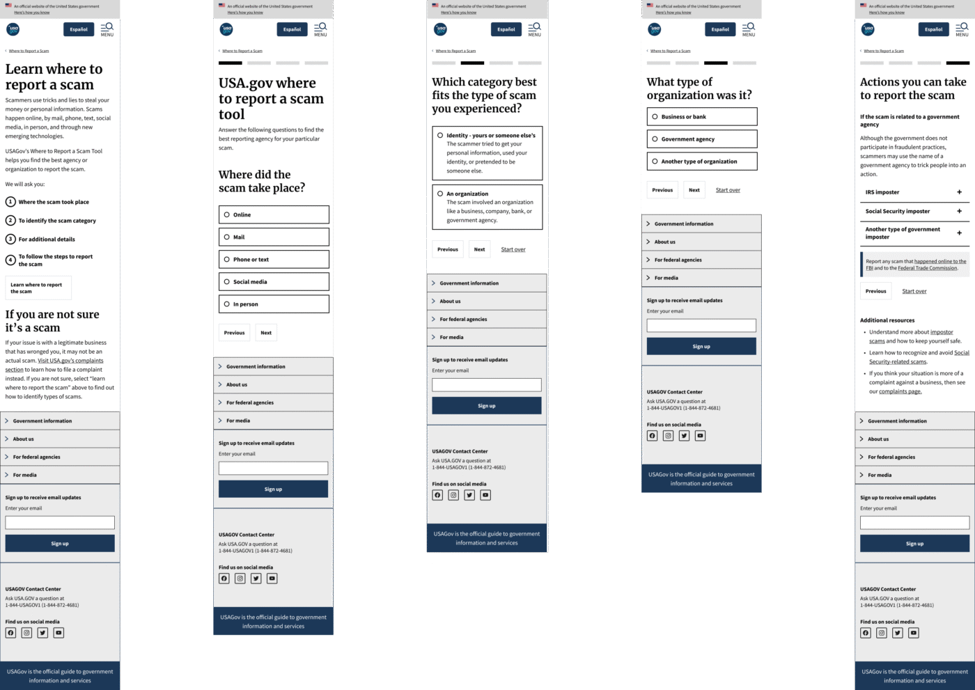
My decision: I restructured the landing page to include:
- A clear explanation that this is a guide, not a reporting platform
- A distinction between scams and business complaints (major confusion point)
- Expected time commitment: 1-2 minutes
The trade-off: This added text to an already content-heavy page. Some stakeholders worried it would increase cognitive load and make bounce rates worse.
Data revealed that people who understood what they were getting into would complete the flow at higher rates than people who jumped in blind and got confused halfway through.

Decision #2:
Rebuilding the IA around how people actually think
The tension: Federal agencies have specific ways they categorize scams. The FTC uses terms like “imposter scam” and “identity theft.” Those terms are technically correct… but nobody talks that way.
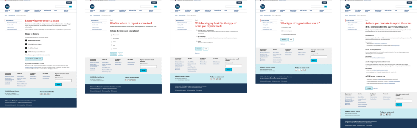
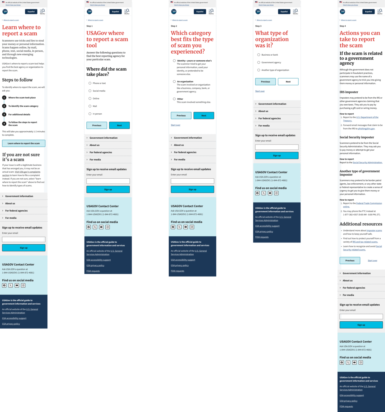
My decision: I proposed a hybrid IA that used delivery method as the entry point (How did you receive this scam? Phone? Text? Email?), then funneled people to the agency-approved categories behind the scenes.
To make this work, I had to:
- Convince the UX team to adopt user-centric language
- Simplify 88 pages of content down to two primary categories: Organization Scams vs. Identity Scams
- Build in an “Other” category to satisfy future conversational AI requirements and any new scam types that comes with emerging technologies
The challenge: The Conversational AI team was building a chatbot in parallel, and my initial design didn’t account for edge cases where users couldn’t match their scam to any category. I had to retrofit “Other” options while maintaining the simplified IA.
This constraint actually improved the final design by forcing clearer pathways. Sometimes limitations push you toward better solutions.
Decision #3:
Accessibility constraints led to better design
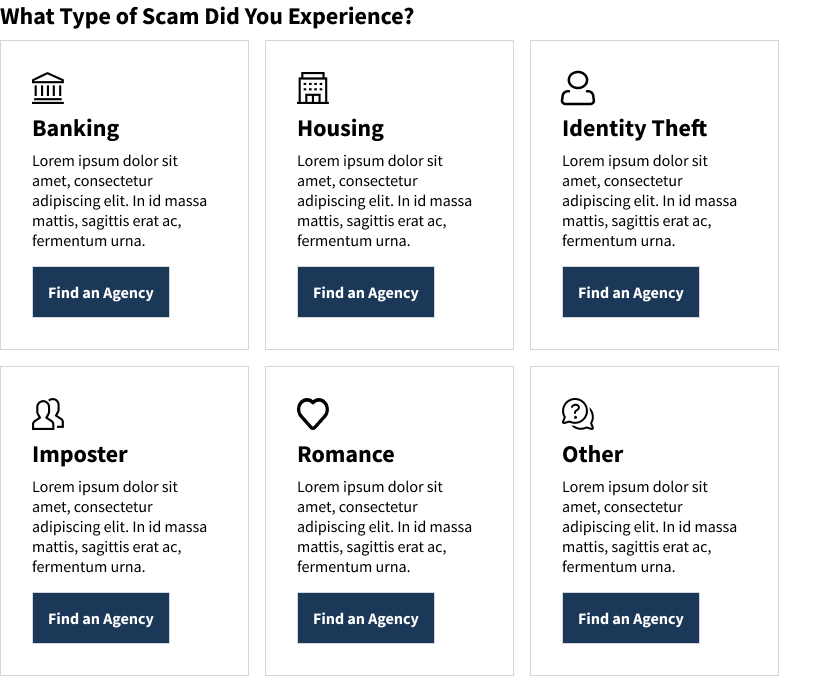
The tension: My initial design used card-based components for results pages. The idea was to give people options—”Here are three ways you can report this scam, pick the one that feels right.”
Then Accessibility review came back with feedback: These cards are going to be a nightmare for screen readers. Especially since most cards pointed to the same destination anyway (the FTC website).
My decision: I scrapped the card pattern entirely and went with streamlined, single-result pages using accordions. This was later changed to radio button selections when the data revealed users skipping over and/or not realizing the accordions were selectable.
But here’s where it got interesting: In usability testing, people kept clicking outside the radio button circle, expecting it to select. They didn’t understand the clickable boundaries.
I advocated for adding hover states to the radio buttons—a micro-interaction that would show people exactly what was selectable. Accessibility initially questioned whether this would confuse screen reader users, but ultimately approved it as an enhancement for everyone.
The trade-off: Fewer choices per screen. Some stakeholders worried this would feel restrictive.
This is guided confidence. People in crisis don’t need options—they need clear next steps.

Decision #4:
Designing for emotional states, not just tasks
The reality: Scam victims are often elderly, low-income, or from minority communities. And they’re arriving at this tool in states of anger, fear, or confusion.
This isn’t a casual “let me check the weather” interaction. This is a crisis moment.
My decision: I advocated for design patterns that prioritized empathy:
- Consistent navigation → I maintained the sidebar structure from other USA.gov pages so people didn’t have to relearn where things were
- Plain language → Worked with the team(s) to eliminate jargon
- Progress transparency → Initially used step indicators; later pivoted to upfront process lists when IA changes made step tracking impractical
I wasn’t just solving usability problems. I was advocating for a design philosophy—trauma-informed design—that influenced how GSA approached other crisis-oriented tools moving forward.
Navigating government reality: every decision needs proof
Let me be real: designing for government is different. Changes that would take days at a startup can take months here. Every decision requires documentation, justification, and multi-layered approval.
Here’s how I adapted:
- Built decision frameworks that stakeholders could reference when I wasn’t in the room → This meant creating documented rationale for why we made certain design choices, so decisions could move forward without bottlenecking on my availability.
- Created comprehensive Figma documentation that developers could implement without constant back-and-forth → Detailed specs, component states, responsive behaviors, accessibility annotations. Everything they needed was in Figma, Trello, or Jira.
- Anticipated accessibility concerns early rather than treating them as final-stage blockers → I worked with the Accessibility team throughout the process, not just at the end.
- Aligned design iterations with strategic timelines → We needed to launch before the end of the government’s fiscal year (Oct 2024). That deadline was non-negotiable. A re-analysis was expected to occur during the 2025 tax season with a larger dataset.
What actually happened:
Outcomes and impact
The numbers:
- Projected 40% improvement in reporting completion rates (metrics are still being tracked post-launch)
- 88 pages redesigned across English and Spanish with full 508 compliance
- Launched ahead of IRS tax season, positioning the tool to serve millions during the peak fraud period
- Stakeholder feedback: The Board noted the design “exceeded expectations in clarity and functionality”
The ripple effects:
- GSA adopted new accessibility patterns from this project for other wizard-style tools
- Created reusable USWDS component documentation that other government designers can leverage
- Influenced the conversational AI team’s approach to handling edge cases and “Other” scenarios
- Positioned USA.gov as a trusted first-stop for fraud guidance, supporting GSA’s broader public service mission
What I learned
- Strategy sometimes means adding friction
Conventional UX wisdom says reduce steps. But the right friction—setting expectations, building trust—can actually improve outcomes. Knowing when to slow people down is just as important as knowing when to speed them up.
- We need to translate between worlds more often
My job wasn’t just designing interfaces. It was translating between user needs, technical constraints, policy requirements, and stakeholder politics. The design was the outcome. Alignment was the work.
- Documentation is strategic influence
In government, your documentation outlives your presence in meetings. Investing in clear, thorough Figma specs and decision frameworks meant my design rationale could advocate for itself across approval chains—even when I wasn’t in the room.
- Accessibility is a design principle, not a checkbox
Rather than treating 508 compliance as a constraint, I positioned it as a forcing function for better design. When Accessibility review rejected my card pattern, it led to a simpler, more effective solution. Constraints breed creativity.
- Launch timing is product strategy
Advocating to ship before IRS season—even with AI integration uncertainty—was a product strategy decision that served millions of vulnerable users when they needed it most. Sometimes “good enough now” beats “perfect later.”
Reflections
This project was a turning point for me. It showed me that design leadership isn’t about making prettier interfaces or having better Figma skills.
It’s about:
- Shaping product strategy by reframing success criteria across stakeholder groups
- Navigating organizational complexity as the connective tissue between teams with competing priorities
- Making strategic trade-offs between user needs, technical constraints, and policy requirements
- Advocating for design decisions through documentation that can withstand government-level scrutiny
- Building scalable systems that influence how organizations approach similar problems
The design work was comprehensive. The impact was measurable. But the leadership was in knowing when to push, when to compromise, and how to align an organization around serving millions of Americans in their most vulnerable moments.
Prototypes
English / Spanish desktop prototype
English / Spanish mobile prototype