Scalable web experience for RockDogs’ franchise growth
Client: RockDogs & PRAYD S.A | Year: 2021
Role:
Lead UI/UX design, wireframing and prototyping
Team:
1 UI/UX designer, 1 visual designer, 1 creative director
Tools:
Figma, Photoshop, Illustrator, Zoho CRM
Goal:
Create a new site that will serve as brand presence and connect to franchising opportunities. Connect CRM for job recruitment and franchise messaging.
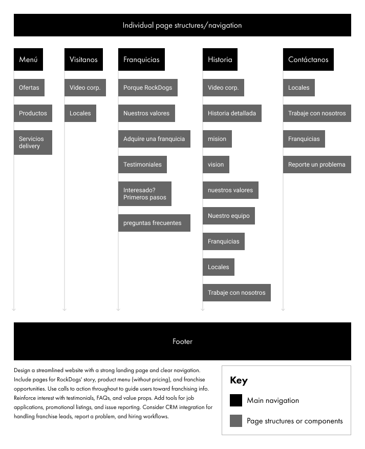
Navigation
From nostalgic icons to a modern franchise platform
In early 2021, we were approached to build a new website for RockDogs Ecuador, a local hotdog chain inspired by the spirit of rock icons from the 80s and 90s. Facing declining sales and a new generation of consumers, they felt their vintage rock references were losing relevance. Their goal was to create a more timeless, rock-inspired experience that could appeal broadly — especially as they looked to grow through franchising. The site was envisioned as a key touchpoint to attract and support entrepreneurs interested in joining the RockDogs family.
Challenges
RockDogs wanted to shift away from their decade-old branding dominated by dark colors, moving toward a brighter palette focused on red and white. This meant we needed to find fresh ways to bring back the brand’s personality and inject a fun, rock-and-roll vibe into the experience.
With no existing website and heavy reliance on social media, there was limited copy available for the site, requiring us to dedicate time to crafting clear, compelling content.
Most franchises were family-owned and operated, with no formalized system for managing franchise opportunities.
They also wanted to integrate a hiring system into the website, allowing applicants to submit resumes that could be routed to multiple store locations.
In early 2021, we were approached to build a new website for RockDogs Ecuador, a local hotdog chain inspired by the spirit of rock icons from the 80s and 90s. Facing declining sales and a new generation of consumers, they felt their vintage rock references were losing relevance. Their goal was to create a more timeless, rock-inspired experience that could appeal broadly — especially as they looked to grow through franchising. The site was envisioned as a key touchpoint to attract and support entrepreneurs interested in joining the RockDogs family.
Target audience
Storefront customers
Our core customers include high school and college students, as well as couples and families looking for a quick, satisfying meal. They’re also people who crave something different from the everyday — an experience that stands out from the usual fast food options. While the vibe is casual, our pricing places us in the mid-range bracket, appealing to those who value quality and convenience without breaking the bank.
Franchise partners
On the franchise side, we’re targeting individuals seeking investment opportunities and those looking to break away from the traditional 9–6 work structure. These are driven, entrepreneurial people who want more control over their lives — often motivated by a desire for financial freedom and the dream of being their own boss.
Hypothesis
- More and more people want to become their own boss by owning a RockDogs franchise, but many don’t know where to start and need guidance on store location and hiring.
- Establishing a strong web presence will help RockDogs appear more stable and trustworthy, encouraging sales and sparking curiosity about franchise opportunities.
- The storefront can attract local customers by promoting special offers, announcing new openings, and making it easier to hire staff.
Step 1: Brand identity and system development
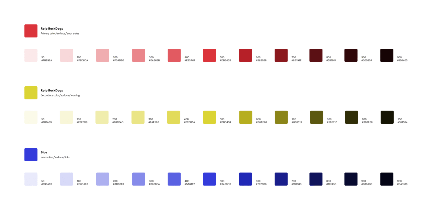
As part of the brand overhaul, I developed a cohesive visual identity that felt versatile, scalable, and consistent across every touchpoint. With the shift away from the traditional black, red, and yellow palette, it was important to explore how the new direction could feel fresh while still honoring the brand’s roots.
Typography
We chose Futura as the primary typeface for the site because it was already part of RockDogs’ visual identity. Its clean, geometric shapes carry the boldness of vintage rock without feeling overly masculine — striking a nice balance that feels welcoming and family-friendly. For email and other system-based applications, we used Arial as a reliable fallback to ensure consistency and readability across platforms.
Color system
Traditionally, RockDogs leaned heavily on black, red, and yellow, with hints of blue throughout. With the new branding, we shifted the focus to a cleaner, more modern look by making white and red the primary colors. Yellow and blue are still part of the palette, but now they serve as accent colors, used more intentionally to add energy without overwhelming the design.
Imagery
All imagery was shot by the creative director (as part of a social media campaign) with a focus on capturing real, active moments. We intentionally avoided the look and feel of stock or staged photos to ensure every image felt authentic and full of energy. This approach helped reinforce the brand’s personality — genuine, vibrant, and connected to its audience.
Step 2: Setting up storefront UX
We began by conducting a competitive analysis of everything from small hot dog stands to large-scale franchises — including food brands with rock-inspired themes. While RockDogs was moving away from its original dark, “rock icon” color palette, we saw an opportunity to evolve the experience without losing its character.
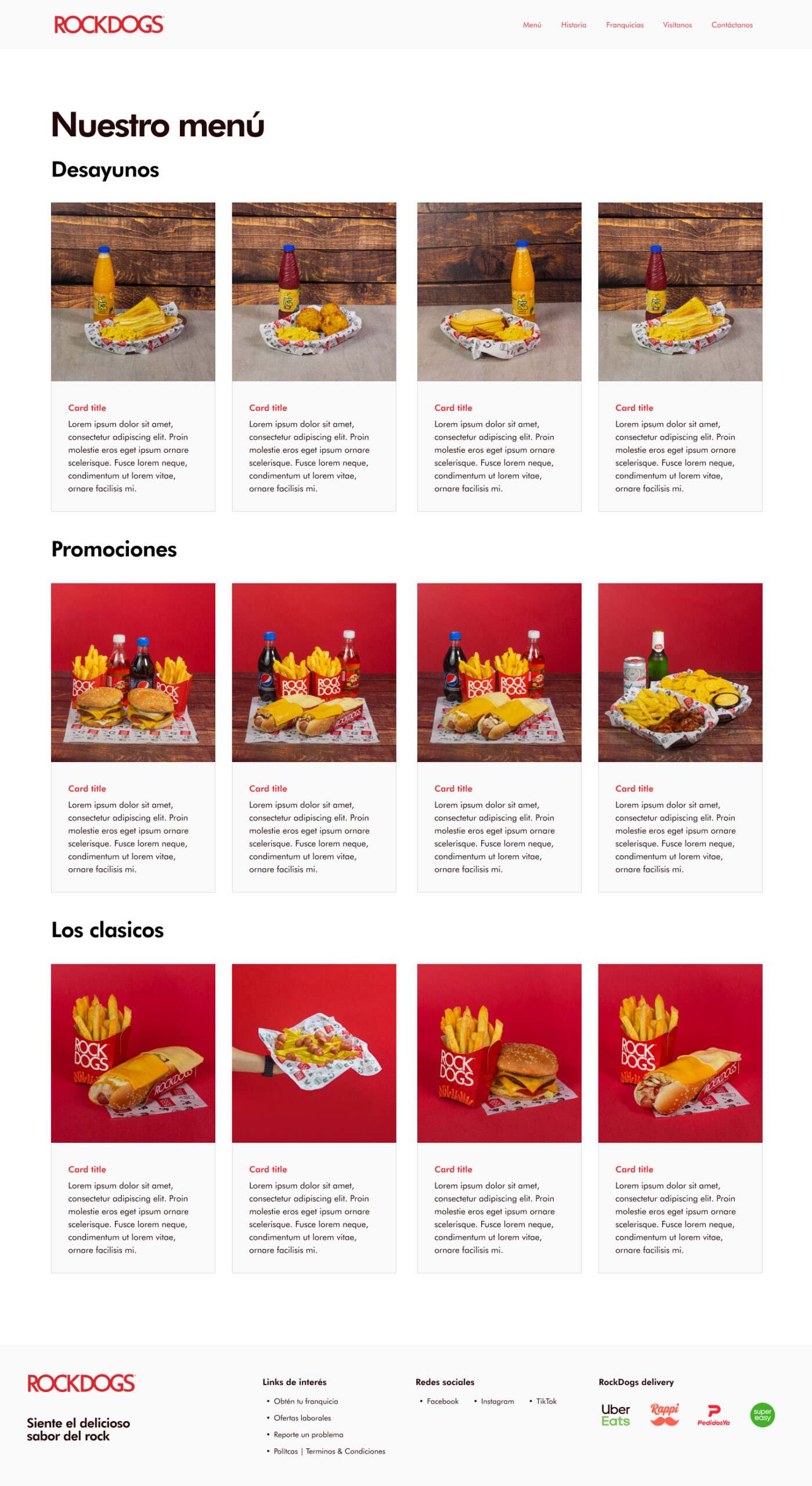
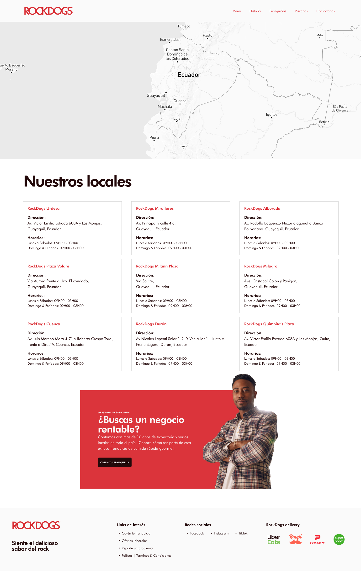
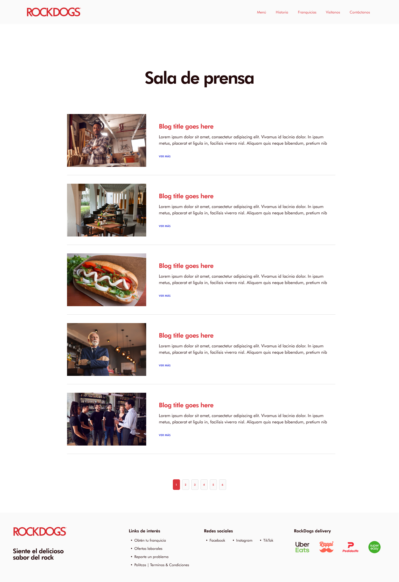
One key insight was the need to make the brand feel larger than a regional chain. To support that, we improved the site architecture by adding key pages: menu, brand history, and current store locations. These additions helped build credibility and gave visitors a fuller picture of the company’s presence.
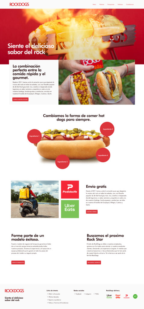
With a target audience of primarily young adults — especially women, who research showed were the most engaged — we aimed to make the site vibrant and welcoming. One design decision was to showcase photos of the actual food, ideally held in hand, to avoid the common disconnect between product shots and real-life experience.
Since each location has its own pricing, we opted to remove fixed prices from the menu, instead focusing on enticing descriptions. Long-term, the plan is to integrate store selection and connect it with delivery platforms.
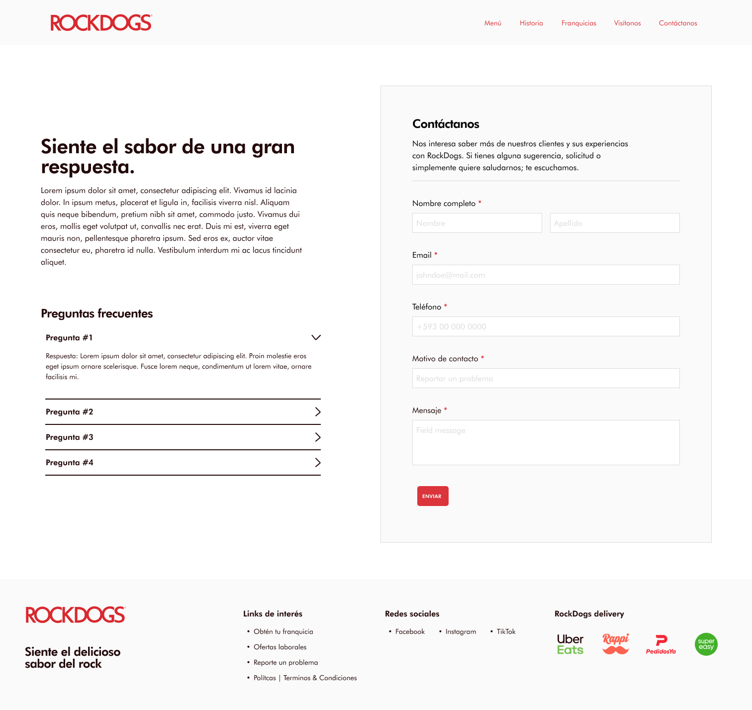
We also recognized a strong post-pandemic demand for job opportunities. To support this, we brought job listings directly into the storefront experience, connecting them to Zoho Recruit for automation and filtering.
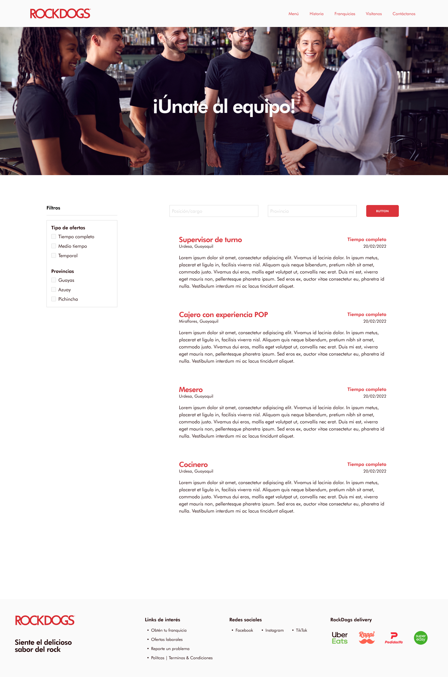

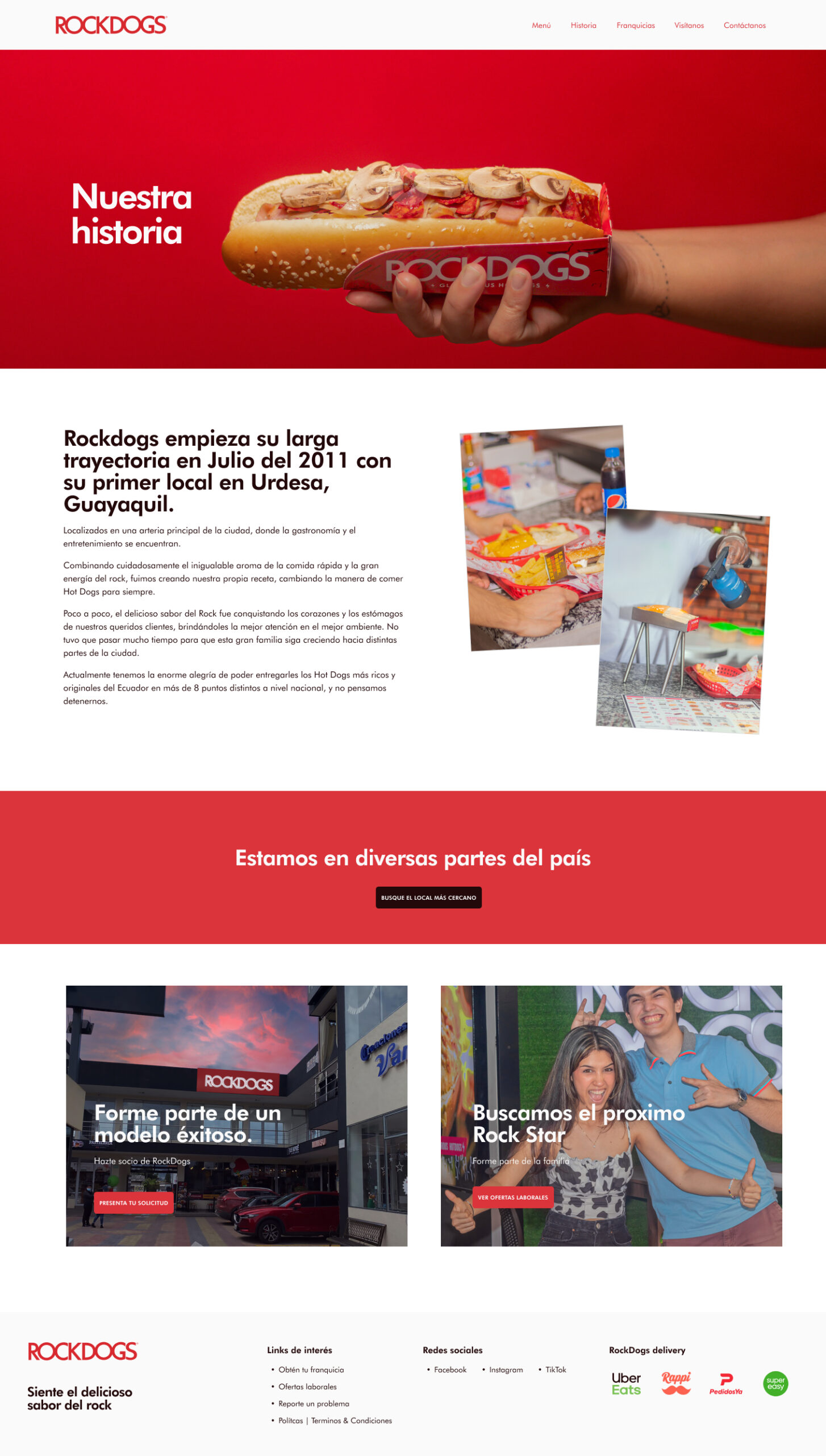
Ultimately, the storefront UX was built to feel approachable and informative, answering real user needs by:
- Listing store locations
- Showcasing job opportunities
- Including a way to report issues
- Serving as a single source of truth for brand and media content
Step 3: Setting up Franchise UX
A key part of this project became designing a lightweight, automated structure to manage contact forms, job applications, brand materials, franchise inquiries, and issue reporting. One of the biggest constraints was the client’s limited leadership bandwidth—most were working full-time in daily operations. To reduce the need for building a custom intranet from scratch, we proposed a scalable, low-cost alternative using Zoho’s suite of tools.
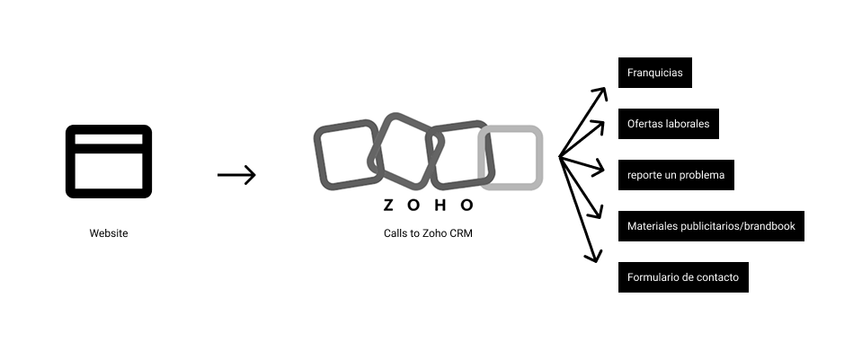
While exploring options for job board functionality, I discovered that Zoho offered a surprisingly complete ecosystem at a price point that made sense for our client. After reviewing alternatives, Zoho stood out as the most feasible and robust solution for their needs.
We focused on integrating the following tools into the website:
- Zoho CRM – to track franchise leads and inquiries
- Zoho Campaigns – to automate follow-ups and newsletters
- Zoho Forms – to collect structured data from site visitors
- Zoho Recruit – to streamline hiring across different store locations
There was a learning curve, particularly around customizing default forms. We needed to tailor them to capture relevant data, then automate responses—such as sending a follow-up email or newsletter 24 hours after submission.

To boost engagement, we also included a visual banner on the site featuring a stock image representing a typical person from the country. The intent was to spark curiosity and invite visitors to explore further.
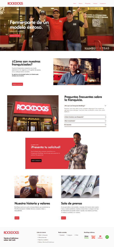
We designed a dedicated franchise opportunities page based on competitive research from McDonald’s Spain, Carl’s Jr., and other regional players. The goal was to answer top-level questions, offer a clear value proposition, and feature a corporate video to encourage users to schedule a meeting. Strategically placed CTAs guided users deeper into the funnel, helping us gauge real interest in opening a franchise.
Long-term vision for franchising opportunities
While the goal of this project was to address RockDogs’ immediate digital needs, it quickly became clear that supporting a growing franchise model would require more robust infrastructure behind the scenes. Although these features weren’t essential for the initial launch, we began outlining a longer-term vision for how the brand could scale its operations and better support franchise partners. Here are a few of the ideas we explored:
- Internal franchise dashboard
– Centralized platform to manage product ordering, hiring, maintenance requests, and brand messaging.
– Role-based access for owners, staff, and corporate. - Franchise timeline & status tracking
– Visual pipeline to monitor each franchise’s stage: inquiry, application, onboarding, launch, active.
– Automated alerts and documentation checklists at each step. - Franchisee training hub
– A self-paced onboarding system with videos, tutorials, and brand guidelines.
– Includes tests and certifications to ensure consistency. - Local marketing toolkit
– Pre-designed, editable assets (flyers, banners, social media posts) tailored for each location.
– Access through the dashboard or via a branded portal. - Performance analytics dashboard
– Integrate sales, customer feedback, and campaign performance per franchise.
– Visual data to support decisions and improve local performance.
- Internal franchise dashboard
Reflections and impact
The project strategy and design was completed within roughly 3 months, with the goal of refreshing RockDogs’ brand by shifting from a dark, outdated color scheme to a lighter, more vibrant palette. I also focused on creating a scalable foundation for growth, ensuring the client could expand seamlessly. The stakeholders were satisfied with the results and began implementing a social media lead-generation campaign. I took the time to teach one of the owners about Zoho CRM integration, and we aligned on long-term strategies. Before leaving the agency, I was informed that they were onboarding a new franchise owner in Quito, Ecuador.
Lessons learned / Insights
- CRM integration requires strategy, not just setup: Connecting key site elements to a platform like Zoho can boost marketing, hiring, and lead management — but it’s not automatic. We had to customize templates, define required fields, and build automations. Even then, hands-on follow-up was essential. A “set-it-and-forget-it” mindset doesn’t work here; we advised hiring dedicated team members for franchise sales.
- Franchising demands dedicated resources: Franchising isn’t just a feature — it’s a business model. Social media generated interest, but most leads stalled after the first touchpoint. Without active nurturing, conversions were unlikely. The client would benefit from outsourcing to a franchise sales team or hiring internal specialists.
- Design for the audience, not just the brand: While the initial visual system was solid, we realized it could be more engaging for families and young adults. Adding playful elements like hand-drawn doodles, sketch-style illustrations, or simple micro-interactions could significantly improve the user experience.