UX takeaways from an outdoor’s product launch in Ecuador
Client: PRAYD S.A & Outdoor Freestyle | Year: 2021
Role:
Lead UI/UX design, social media designs and web development
Team:
1 UI/UX designer, 3 visual designers, 1 project manager/creative director
Tools:
Figma, Miro, Photoshop, Illustrator, After-effects, Premier Pro, ClickUp, WordPress CMS
Goal:
Create a new e-commerce site with WooCommerce, integrating delivery across the country.
Navigation
Building an e-commerce experience through ambiguity and insight
In 2021, Amazon was not yet available for local door-to-door shipping in Ecuador. In most cases, people would send products to a US address, place the products in their luggage and try to re-sell them inside the country. This would increase profit margins while simultaneously avoiding high import fees.
Outdoor Freestyle wanted to change that by creating a dropshipping model and requested to create a site that would help improve their chances of selling domestically as an Amazon distributor for the country. This request would come to include standardizing their brand logo, brand colors, and creating a repeatable system that can be extended with social media graphics.
Spanning the course of about three months, I led the work with a series of strategies, UX improvements, visual and motion design.
We had three immediate problems ;
- Attracting the right people
- Setting up payment
Designing experiences that build trust in digital transactions in a low-trust market

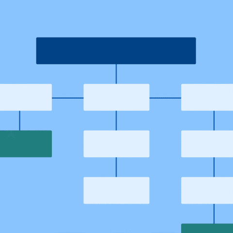
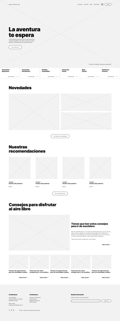
Task one: strategizing and wireframing
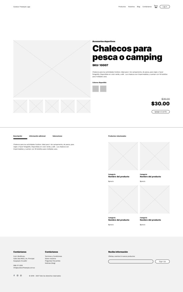
Campfire, fishing and tent-making recreations are not common in Guayaquil because of the city’s infrastructure and reduced wildlife. While we are certain many Guayaquileños would be interested in doing these activities, we needed to avoid references to a specific city, instead opting for the spirit of freedom and one-ness with nature. This helped us identify a good portion of interested individuals living in the highlands and throughout the country. We also identified local industries that catered to the outdoor lifestyle. We saw possibility.
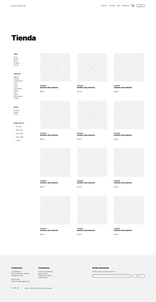
I did a quick competitive analysis and found myself inspired by REI, Outside Magazine and other outdoor brands. I aimed to create clearly defined primary and secondary navigations, creating product categories that best fit with current product lists. Clearly identifying the new and recommended products and a consideration for blogs and articles.
It was important to get an idea, although subject to change, on how the site might look once we started adding details to the products. Equally important, we needed to understand where the user might leave the site. I looked into an abandoned cart functionality that would remind the user at least three times of their items ready for purchase via email.
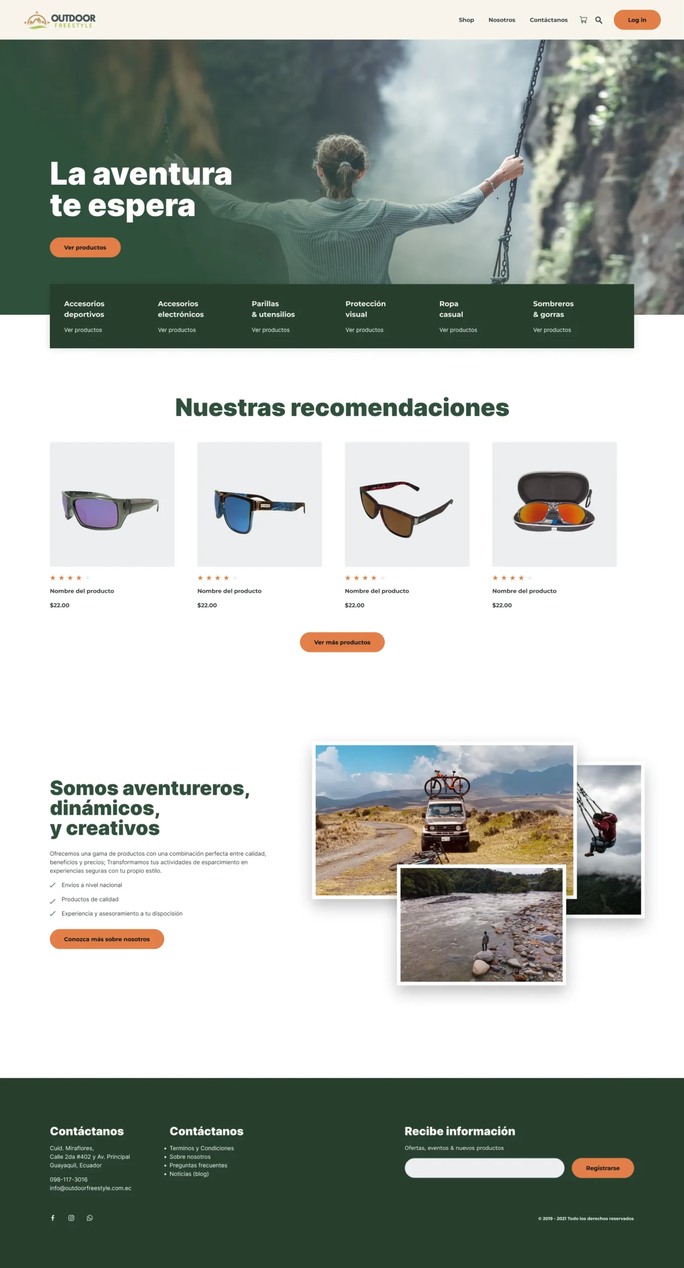
I tried to show the feeling of being free and with nature as much as possible. That idea also allowed us to think about using images like the old Kodak photographs with borders, calling to a time when we did not have so many distractions. With a natural earth-tone pallet, the ideas took shape.
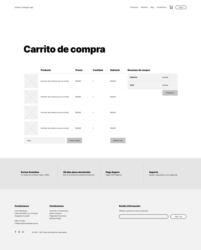
For the sake of time, we stripped back non-essential pages, consolidating content to improve client behaviors and getting people straight to the products they want. Since WooCommerce already had an established flow for purchase, it wasn’t necessary at this stage to change its appearance other than to adhere to the brand system.
Task two: payment platforms and results
Setting up payment platforms in Ecuador is…complicated. Ecommerce has been around in the US for over a decade. Over that time, vendors and clients have established trust, and we catch bad actors quickly. In Ecuador, those protections do may exist, but are not available outright, creating an aura of distrust between users and vendors once a credit or debit card is required for online purchases. Adding to this, banks are have rigid regulations on who can process payment transactions; only two companies could process payments—Kushki and Paymentez.
No Stripe, no PayPal, no direct withdrawal. The process of connecting an account to process payments is a UX challenge of its own.
While my client focused on the payment authorizers, I started building the site with WordPress and WooCommerce. After presenting initial drafts, the client wanted something that felt more corporate instead of some of the more adventurous aspects proposed thru conversations. This seemed to be related to a matter of creating trust in an untrustworthy market. I wanted to make sure we maintained some aspects of adventure and going through a journey. We agreed to maintain the photographic frames.
The next challenge: shipping and delivery. Ecuador does not have an equivalent of the United States Post Office (USPS). Most streets lack a single name; sometimes people refer to them by two or three different names. Many homes and entire communities also lack municipal registration—referred to as “invasions”—meaning they have no assigned number or address. Because of this complexity, we could not handle shipping in a traditional sense. We opted to use ServiEntrega—a reliable door-to-door courier service similar to UPS/DHL local to the country.
The hard part was making sense of pricing inside of the cities of Guayaquil, Quito, and Galapagos, which had various pricing models and working it through WooCommerce. Thankfully, ServiEntrega could offer documentation and we could make sense of it.
After the initial launch, several revisions that included updating the design system and improving language. I am proud to say it has launched. The initial feedback from the public was very positive, with an increased page view and interest. Coupled with social media, the possibilities for Outdoor Freestyle are boundless.
Task three: social media and advertisements
Social media is king in Ecuador. Since its creation, it has become the primary arena for selling and marketing yourself. Websites are minimal in comparison. As such, I knew we needed a social strategy. It was simple, but it worked:
- Creating posts for social engagements, such as tips and recommendations.
- Post that foster brand awareness
- Post that sell products
- Connect the ecommerce store with Facebook pixels, upload catalog and promote for target audiences.
We were considering leads at one point, but opted out since we did not know what to do with them. Looking back, we could have gathered a list of outdoor providers and created partnerships, but hindsight is 20/20.
Here are a few of the designs I created during that time.
Lessons learned
Covid, for better-or-worse, has forced us to change—especially market trends. With these changes and specifically in developing nations, it presents unique situations and challenges. With ecommerce in 2020 Ecuador I’ve learned;
- There is a general distrust on utilizing your credit/debit card for online transaction which stems from the financial crisis of 1999/2000. People are afraid of the bank taking their money or sending it off to a total stranger with limited solutions for bad actors. They do not fear identity theft, they fear they will be locked out of their bank account or the bank will initiate investigations on them.
- Shipping options are few, mainly Servientrega, DHL, UPS and small independent carriers. Unfortunately, this creates high shipping cost within the region. I don’t know a quick solution to this problem, but I suspect that ecommerce’s growth in the area may create new competitive shipping industries in the years to come.
- Social media selling is not going away. It’s a powerful asset for developing brands. Connecting social to websites via Facebook pixels or others will increase brand trust and confidence and keep you at the top of mind. Ecommerce platforms can leverage this user behavior to be everywhere-at-once.
- Regarding Ecuador, there are many opportunities for ecommerce to flourish once you pass the technical hurdles. There is a growing trend for simplification and making life easier that will affect the market in the future.
- WooCommerce is great but not perfect. Here, it needed to be paired with additional plugins to email users on abandoned carts, to create dynamic listing features and to extend out-of-the-box functionalities. If you decide to build a site with WordPress and WooCommerce, I’d recommend looking at the WooCommerce extensions.
- Though I would have preferred to make the site more adventurous, the need to create something that inspires trust is understandable. Among the inspirations, I believe something that added custom illustrations would have worked perfectly.
